
Understanding color schemes with Relume
Learn how Relume thinks about and applies color schemes using AI.
In this doc you’ll learn:
- Why we have built color schemes in this way
- Understanding color schemes in the Relume Site Builder
- How to apply and customize color schemes in Figma
- How to apply and customize color schemes in Webflow
Why we have built color schemes in this way
Color schemes in Relume were crafted to apply color in a systematic and consistent way, making it quick and easy to move from a black and white wireframe, to something that looks more like a designed website.
Our mental model for color schemes
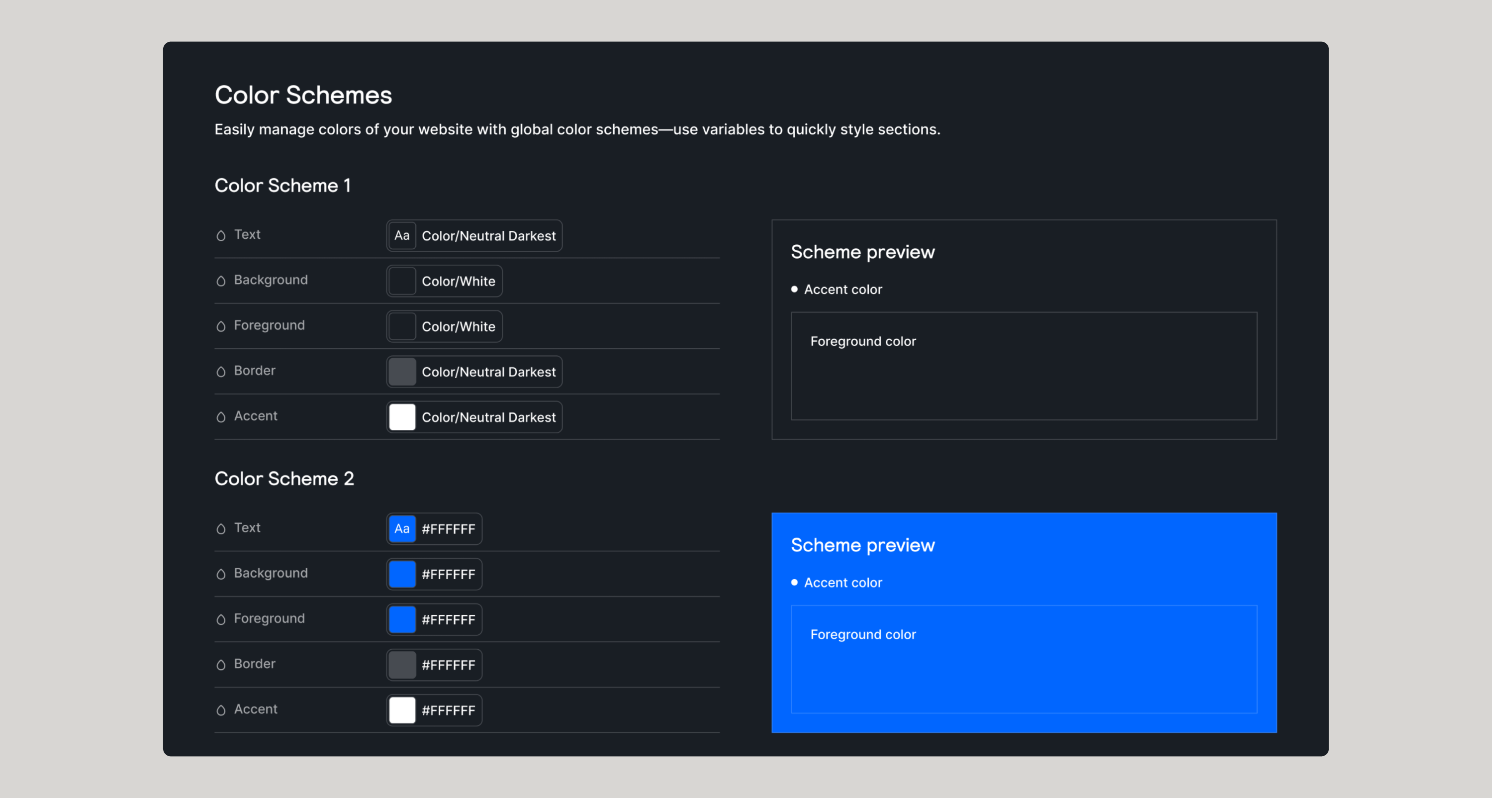
Based on countless hours of research, unpacking the most common patterns across thousands of websites, we discovered that the foundations of a section color scheme consist of the following color scheme settings:
- Text color
- Foreground color
- Background color
- Border color
- Accent Color
Let’s break down the purpose of each color scheme setting.
Text color
We meticulously researched and tested accessibility documentation, tools and discovered a contrast system that allows us to automatically detect what the color text should be based on the background and allow for the most optimized contrast. If you choose a dark color background, the text will change to be white or vice versa, automatically.
Foreground color
When thinking about foreground color, we want to bring subtle attention or differentiation to an element or component within a section. An example of this would be if we had a 3 column layout with cards. We would apply the foreground color to the cards to make them standout from the background in a subtle way. This color is generally some slightly lighter variant of the background color setting.
Background color
This setting is what drives the whole color scheme. Everything else is based on this color. If you make the background color a dark color, the whole scheme shifts to adapt, automatically.
Border color
We’ve intentionally created a set of transparent variables that could be used for many different elements within your projects but we use it within the Relume Site Builder to help color the border in a way that makes it adaptable without creating complexity in the system.
Similar to text color, the border color will adapt to a light or dark transparent border based on the background, allowing for a subtle contrast.
Accent color
The primary purpose of the accent color is to be used sparingly and in most cases it is used for the main CTA button within a section. As of today, this color was not utilized in the generating of a design due to how complex the decision tree is on when to use it, but it is here for you to use when you export to Figma or Webflow.
What color schemes are not
We have intentionally limited the ability to color specific elements (buttons, text, cards, etc) in order to keep the system simple and consistent as well as allowing for super quick decision making.
You will also notice that it is not possible to specifically change the foreground, border, accent or text colors individually - again this was intentional to keep the system simple.
Speed to concept, never miss
You might be asking yourself - “why can’t I just choose the color of an individual element?” - and this is a valid question. But our core values at Relume are to reduce complexity, increase speed, and to be good by default. We’re building in guardrails so that you never miss. Within a click or two, you can generate a new color scheme, or swap the scheme of an entire section in a click. This simplicity and speed has only one downside: flexibility.
Understanding color schemes in the Relume Site Builder
Let’s dive into how we can customize color schemes and apply them within the Relume Site Builder.
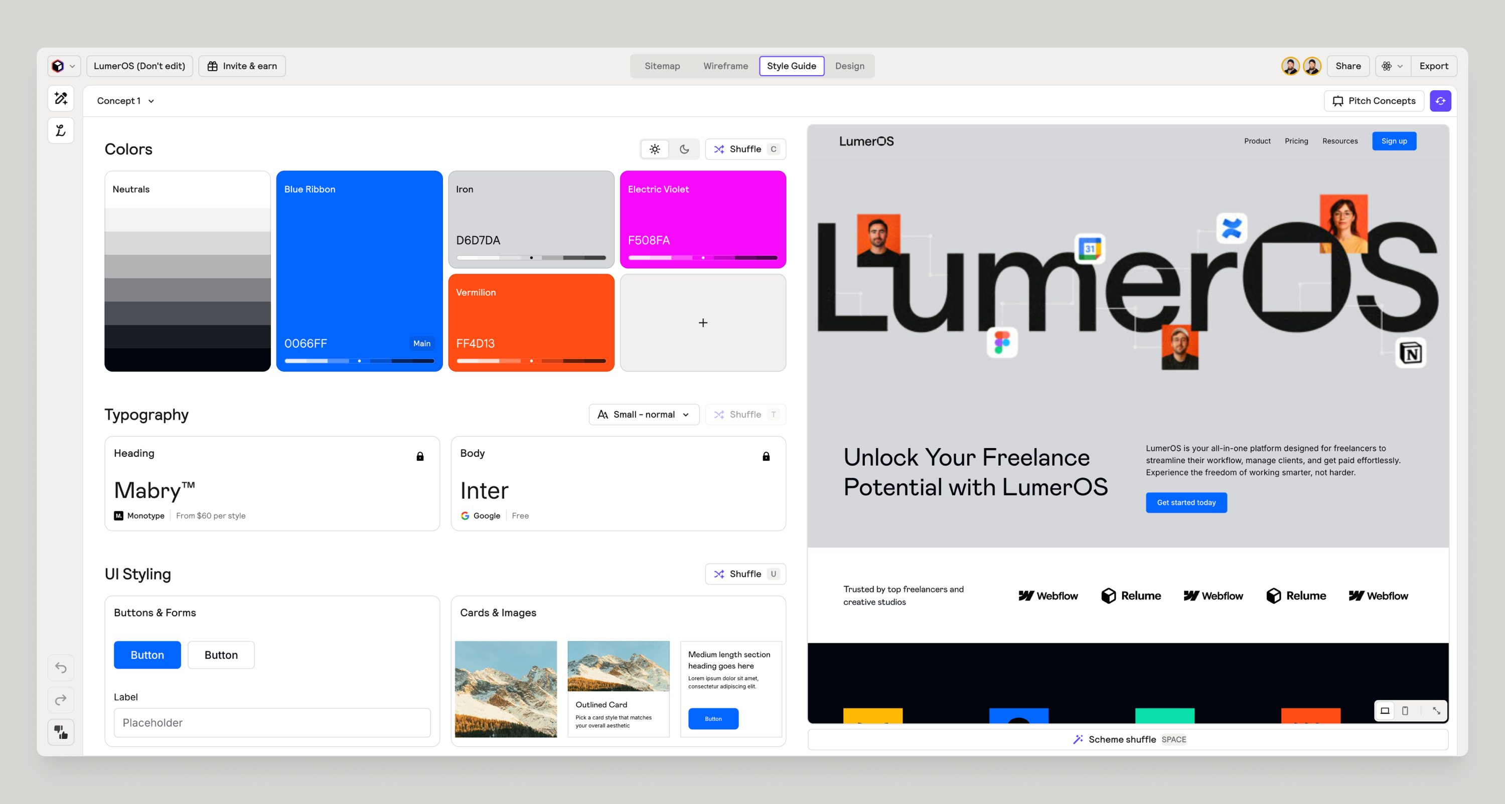
Defining colors
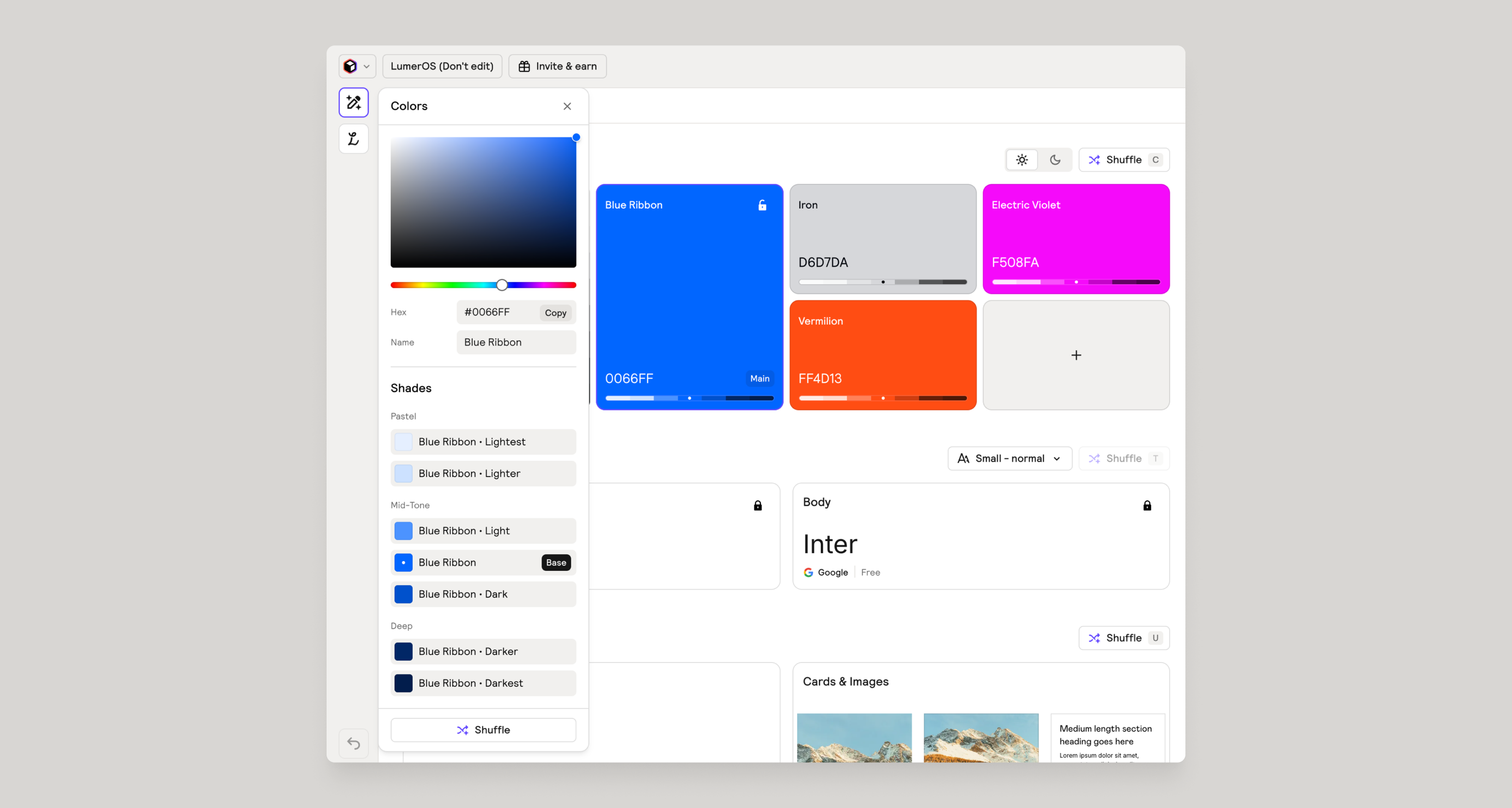
You have the ability to add up to 5 colors to your palette. Each color will generate 6 shades that could be used in various ways throughout our color schemes.
You can paste in HEX color codes manually to bring in an existing brand color palette. As of today, there is no way to import in bulk a color palette.
Defining neutrals
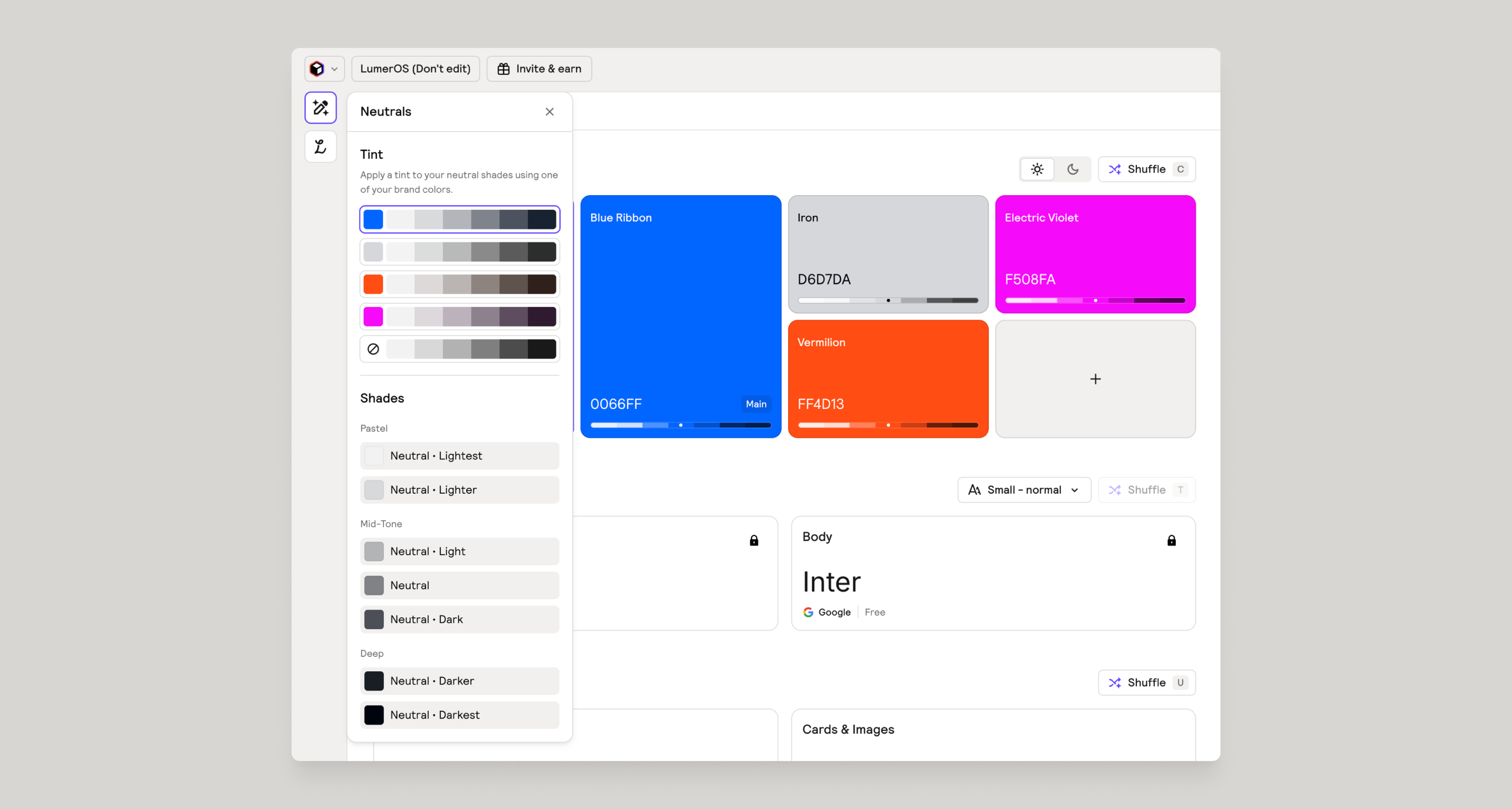
To really take your design to the next level, you can also change the tint of the neutral to match one of the colors within your palette.
Light theme versus dark theme
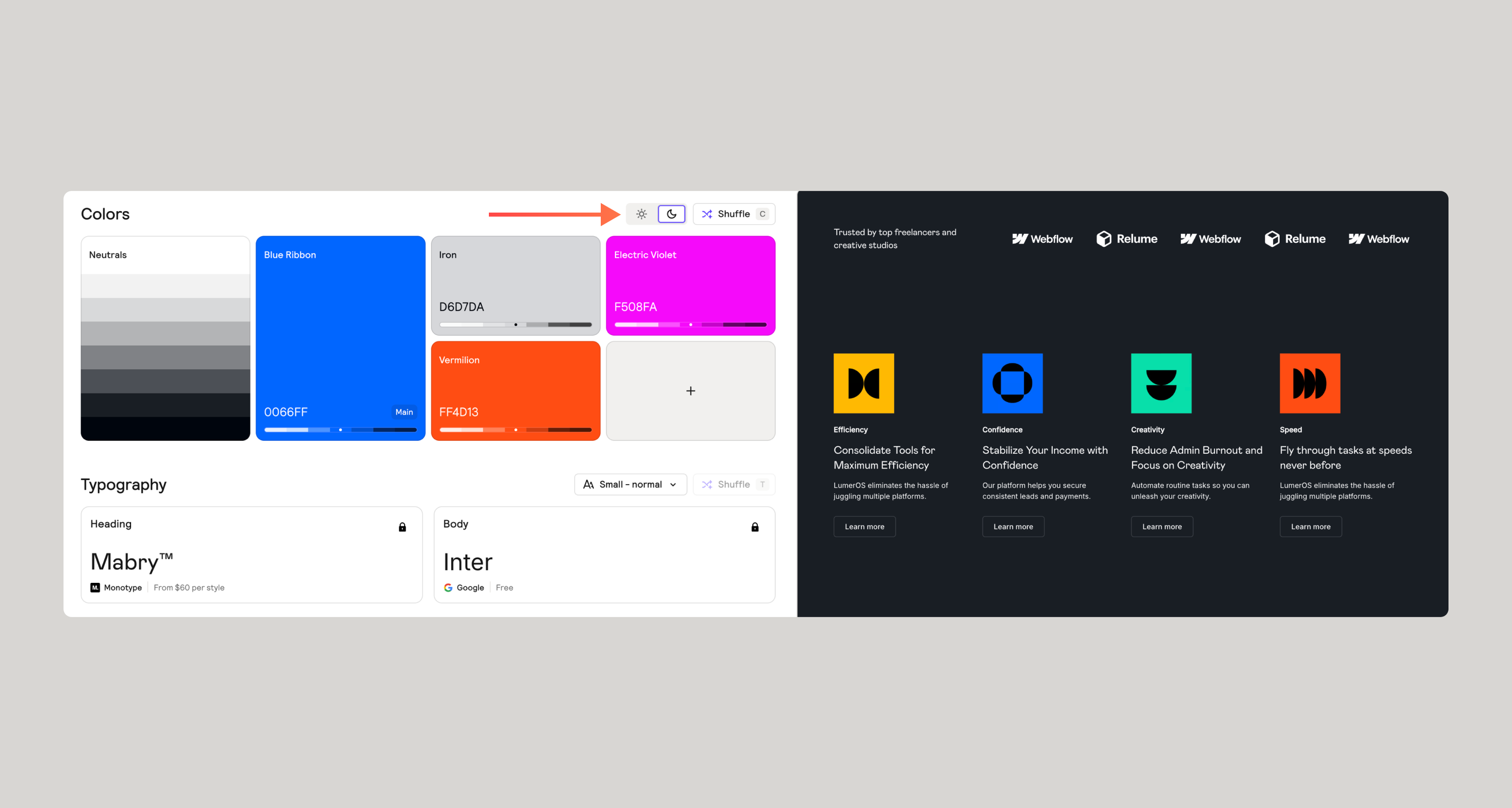
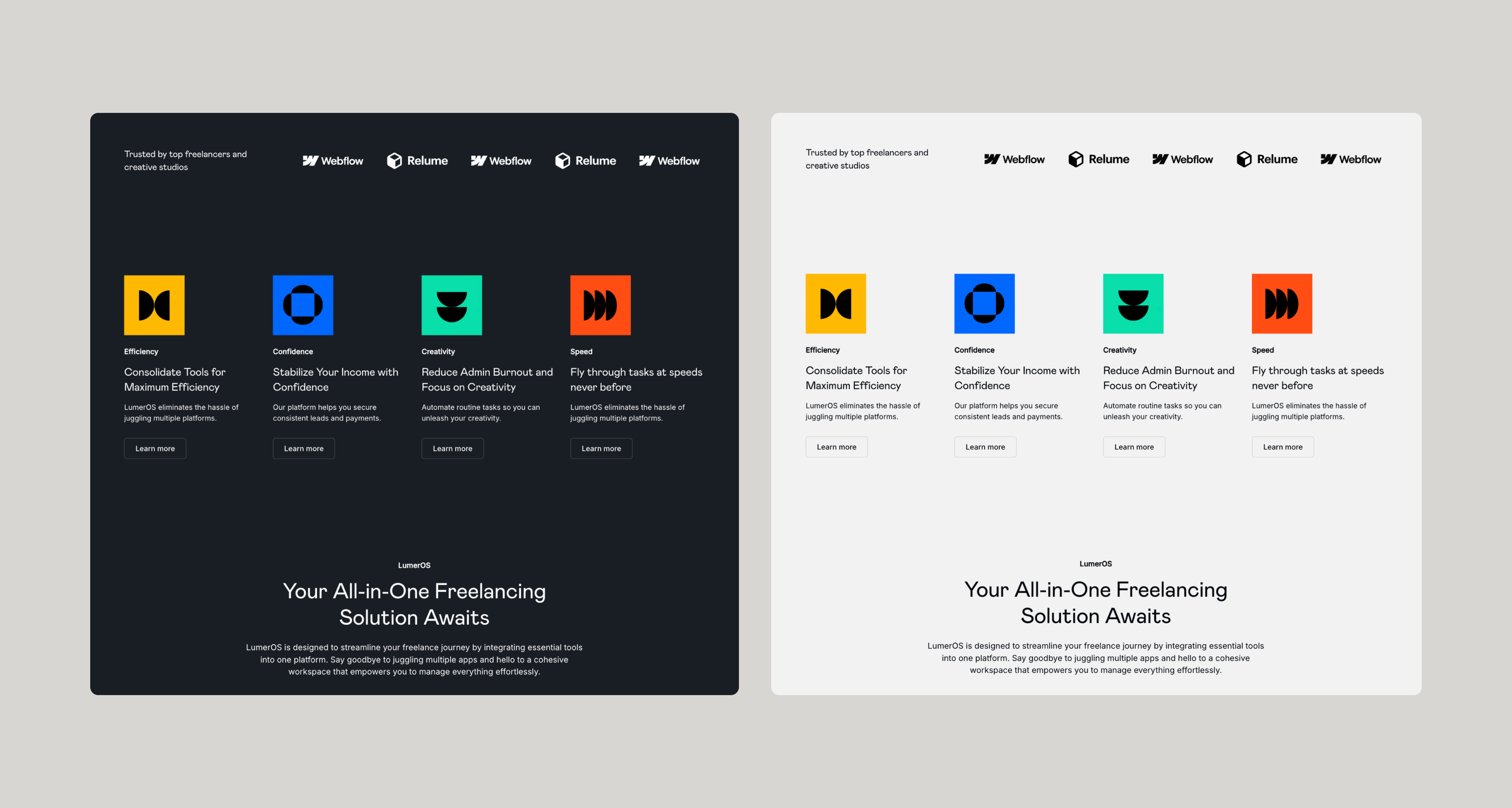
This is different than a light/dark mode. We’re not talking about a toggle of a mode, but rather a design decision that you will have to make on whether or not you want a light theme or dark theme. This will invert colors based on extensive color contrast research.
Applying color schemes to a section
Clicking on a section will let you cycle through your predefined color schemes. You can see your color schemes by hovering over a section.
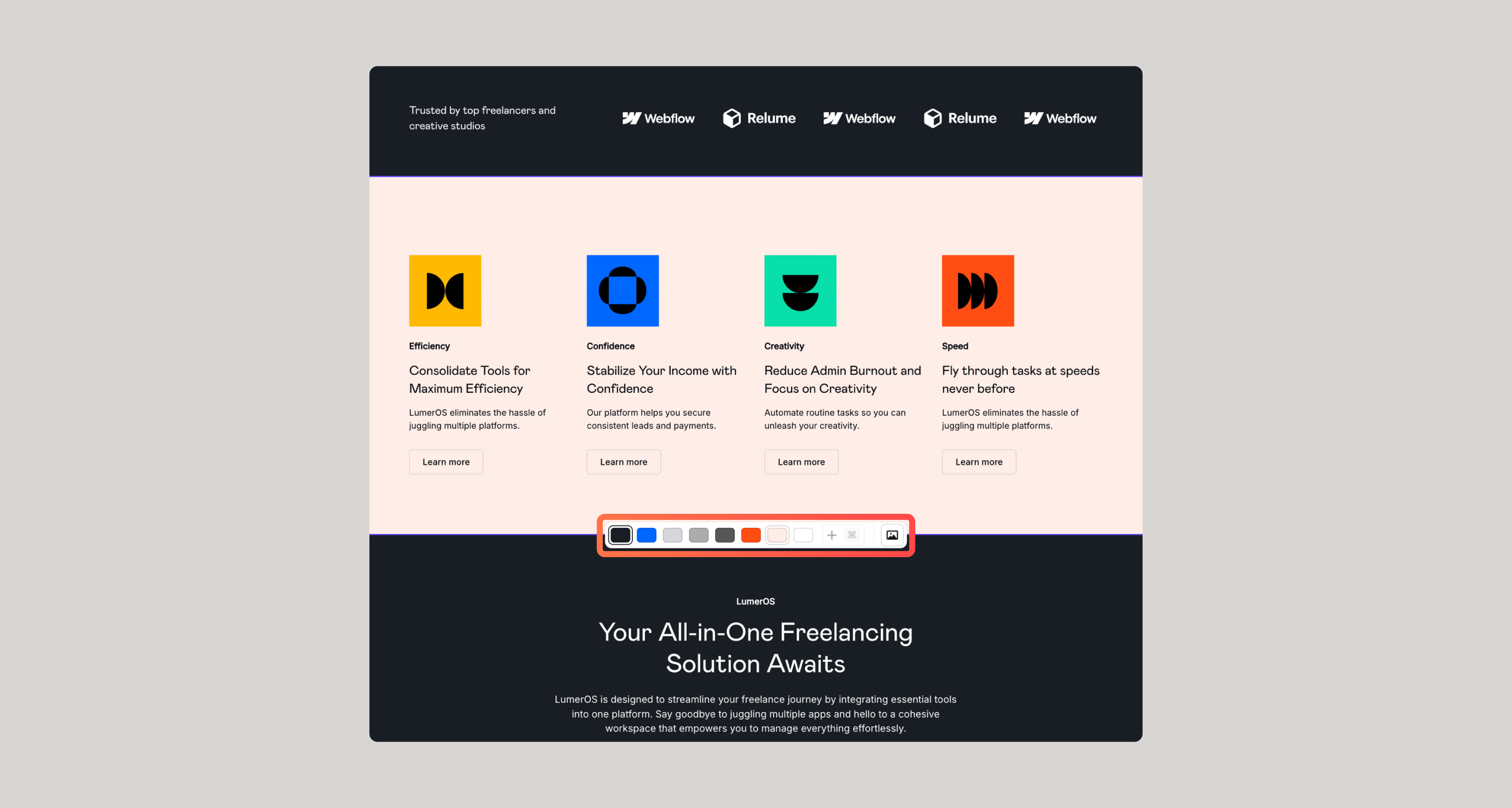
Adding or removing color schemes
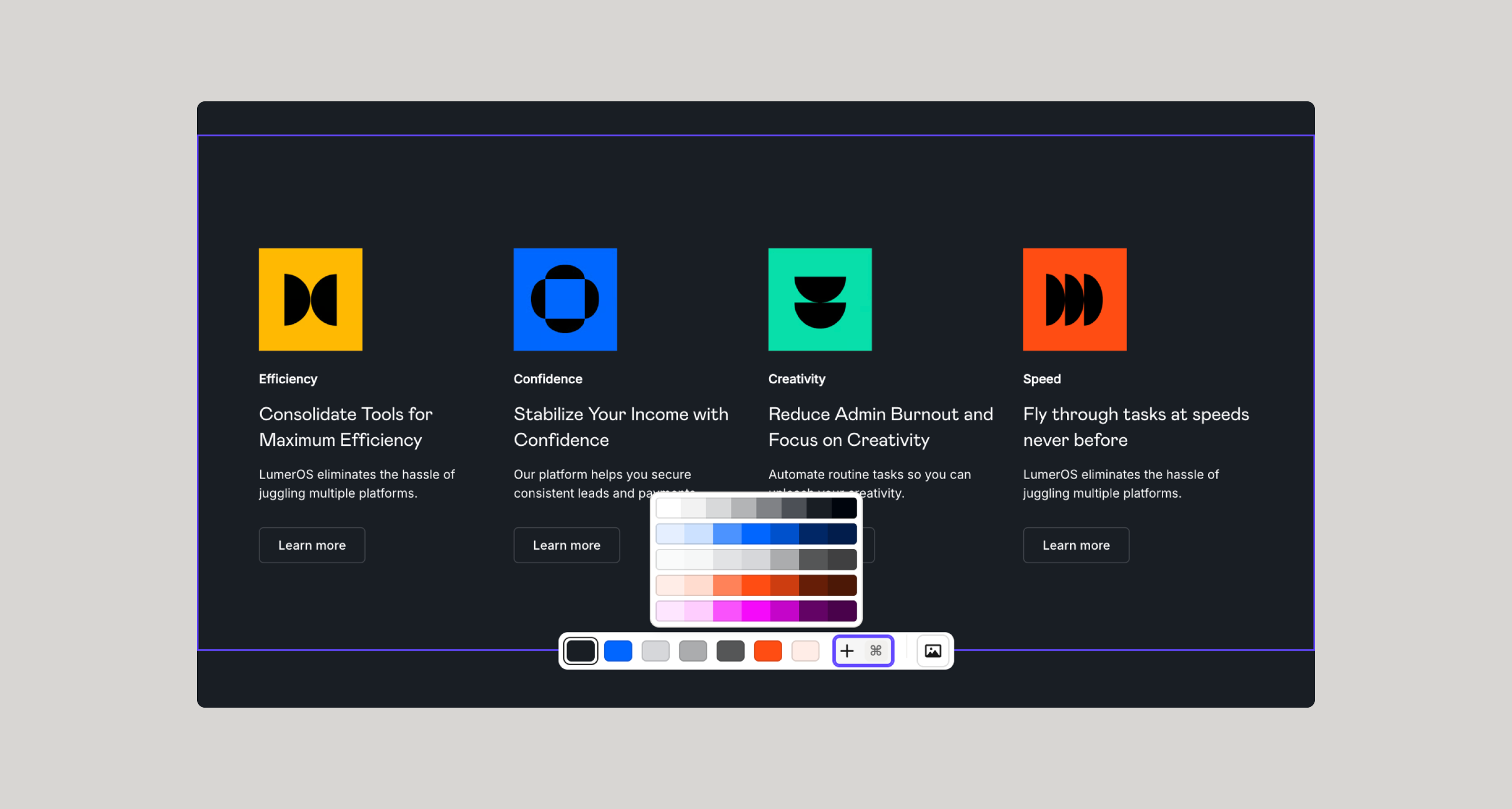
When hovering over a section, you’ll notice a plus button. You can also hold the cmd button to enable the color picker to choose a new background color, which will effectively create a new scheme you can use throughout your project.
To remove a color, simply hover over the small pill and you’ll see a minus icon - clicking on the pill twice will remove the color scheme.
How to apply and customize color schemes in Figma
{{note-styleguide-override="/resources/assets/rtc"}}
{{note-figma-kit="/resources/assets/rtc"}}
Using the Relume Figma Plugin is the fastest way to bring your color schemes into Figma.
But in some cases, you may want to customize the color schemes - just note that your customizations don’t sync back to the Relume Site Builder and you would have to make the same customizations when you go to import into Webflow.
Adding and applying a new color scheme in Figma variables
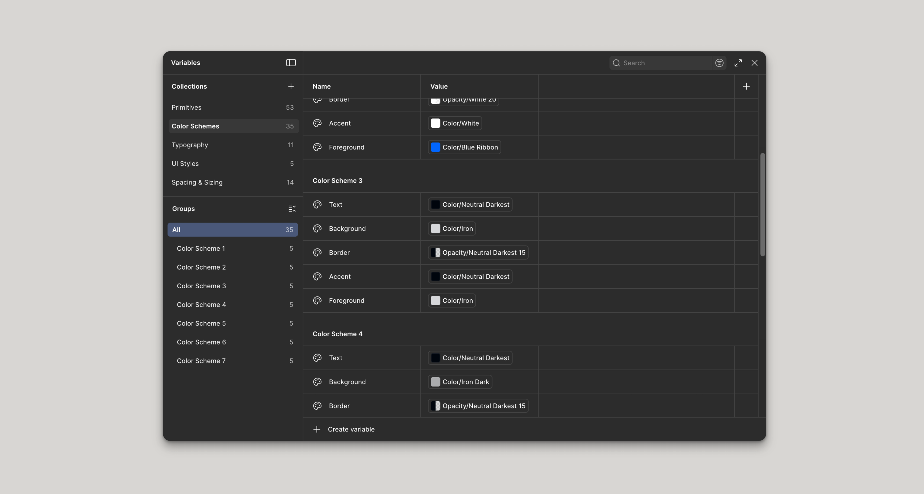
- Duplicate the Color Scheme 1 group - figma should rename this group to Color Scheme 2 automatically.
- Assign primitive color variables to the various color scheme settings.
- Navigate to a section on a page, and swap each color scheme setting that was assigned Color Scheme 1 and simply assign those same settings but now to Color Scheme 2.
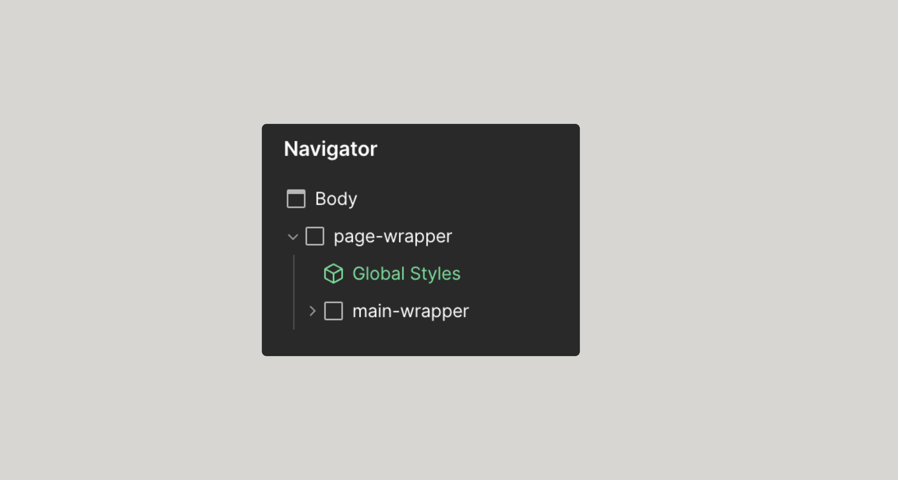
Adding a new color scheme reference on the style guide page
- Navigate to the Style Guide page within Figma and find the Colors frame
- Duplicate the Color Scheme 1 layer.
- Manually rename the section to Color Scheme 2.
- Follow the same process as above - replacing any references to Color Scheme 1 settings, and reassign to the newly created Color Scheme 2 settings.
What happens if I make changes in Relume Site Builder?
If you’ve made customizations to the style guide within Figma, and you have also made changes in the Relume Site Builder and attempt to make another import, all of your customizations in Figma will be overwritten.
If you’ve introduced a new color scheme in the Relume Site Builder and import that into Figma, your newly created color schemes will also be overwritten.
It’s best to look at Relume Site Builder as a one-way, one-time sync. Make sure you have everything you want setup the way you want it before importing into Figma.
How to apply and customize color schemes in Webflow
{{note-styleguide-once="/resources/assets/rtc"}}
{{note-webflow-clone="/resources/assets/rtc"}}
Where the real magic of the Relume color schemes comes into play is with Webflow. Changing a color scheme of a section is as simple as applying a color scheme combo class to any section, and everything just works.
Let’s dive into how this works and how we can customize this implementation.
The foundations
We’re leveraging the power of CSS - Cascading Style Sheets. It’s in the name - cascading. We want to limit how far down the document we apply styles so that we can leverage the cascading effect of CSS as much as possible. It’s not always 100% possible, and that’s fine - be intentional about your changes here.
Custom Code
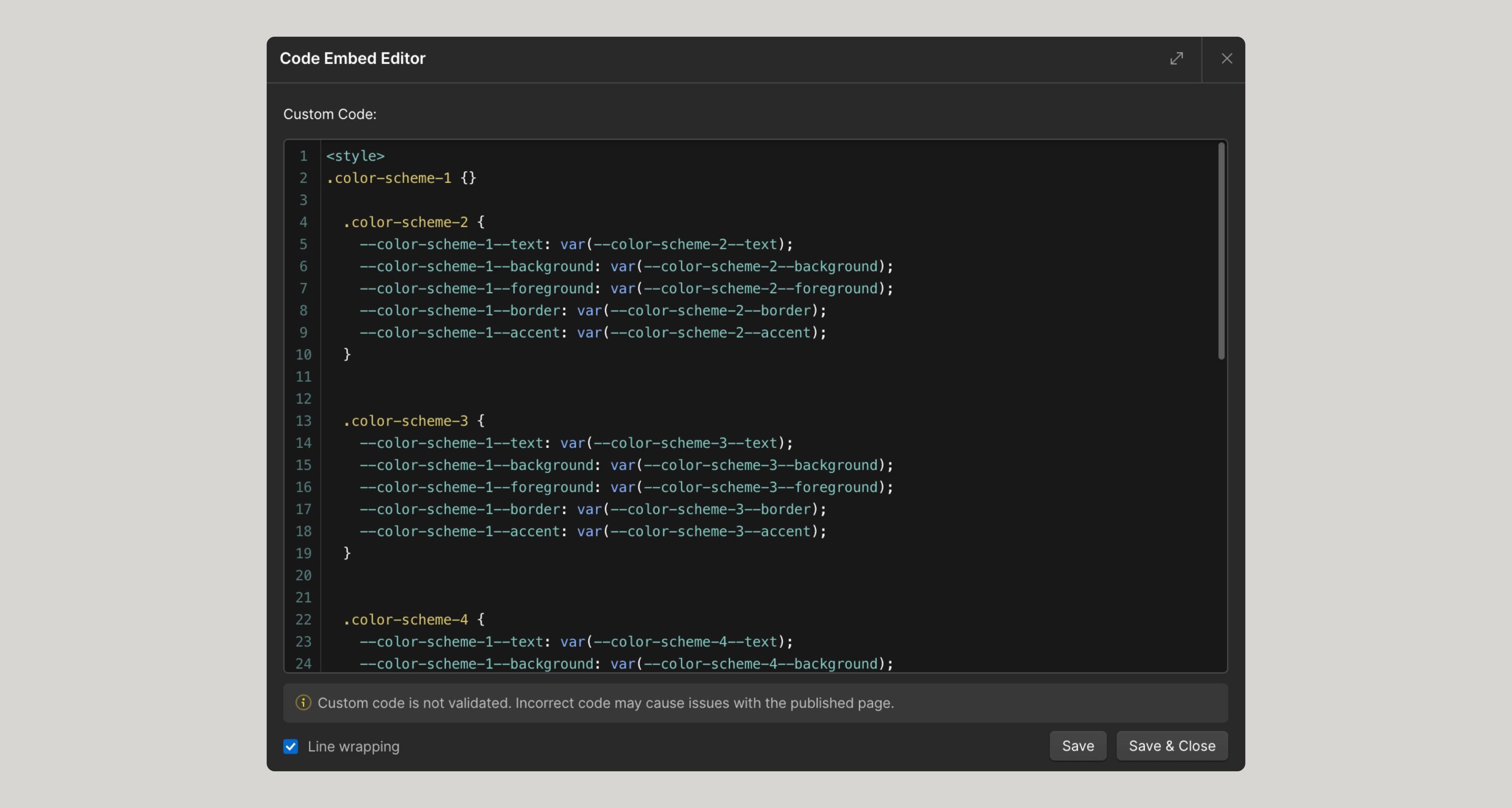
The most important piece of our color schemes is the custom code we have to use to hold everything together.
Since it is not possible to predict how many color schemes any given project would have using the Relume Site Builder, every component in our library is assigned by default Color Scheme 1 settings. Foreground, background, and border color variables are assigned to the appropriate elements within the component.
We use some CSS magic to “reassign” the color scheme 1 settings, to a different set of color scheme variables based on a combo class.
So if I have Color Scheme 2 variables, and I apply a color-scheme-2 class to a section, this custom CSS code will do the magic for us.
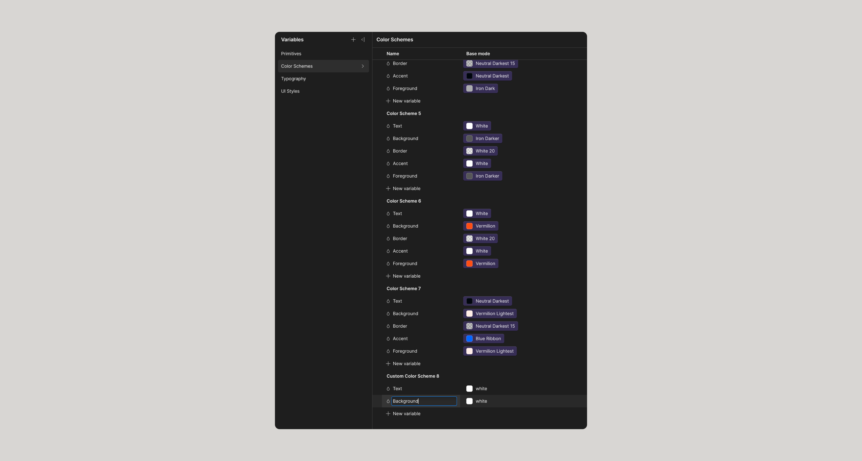
Variables
We have several groups of variables that contribute to color schemes using Relume in Webflow.
Primitives
This is the lowest reference to a color within the design system. White, Black, Red, Green, etc.
You assign primitive variables to other variables within the design system.
Color Schemes
Are a collection of primitive color variables assigned to very specific setting within a component. Foreground, Background, Border, Text, etc.
The other two groups don’t relate to color schemes - typography and UI Styles are in here to support additional settings that you could adjust in the Relume Site Builder.
How to add and apply a new custom color scheme in Webflow
Start by creating the variables following the same pattern as Color Scheme 1.
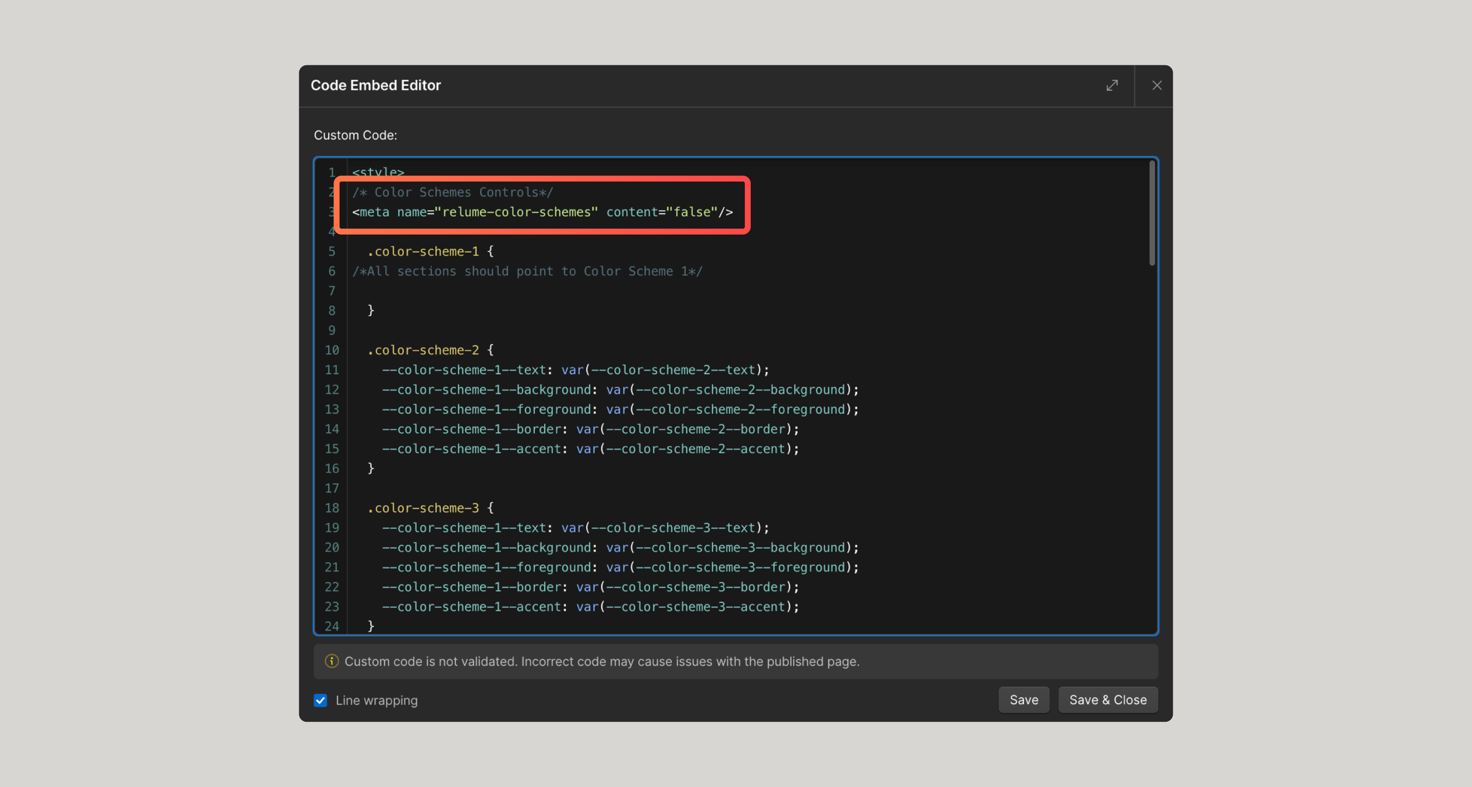
{{note-remove-meta="/resources/assets/rtc"}}
- Click on the blue New Variable top right and choose Color and type Color Scheme 2/Text and hit enter.
- Click on New Variable within that group - right below the new text variable you just created and continue this process until you have all the same variables as Color Scheme 1.
- Navigate to the Global Styles component > Color schemes
- Copy the CSS for color schemes
In conclusion, the fastest way to work with color schemes is to import them directly from the Relume Site Builder using the Relume Webflow App, but the system is flexible enough to allow for customizations and quick updates.
Happy building!
Give feedback
Was this resource helpful?
Related


For account-related issues, please contact support@relume.io.
