
Customizing the Figma Kit
Learn how to customize the Figma Kit and speed up your Figma workflow.
In this doc you’ll learn how to:
- Customize typography
- Customize elements such as logos, buttons, forms, heading tags and other HTML tags.
- Adding your own custom color variables
- Customizing existing color variables
How to customize typography
Using the Batch Styler Plugin is the easiest way to customize the typography in the Figma kit. You’ll select all of the text styles and then choose the font you’d like to use. If you want to customize the headings to be one font and other text styles to be another font, you can select them individually.

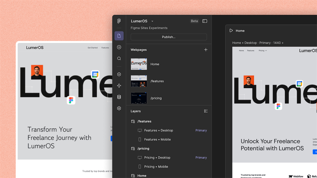
Customizing UI elements
We’ll walk through the various common elements and a few tips to streamline the process. The actual customizations that you make are completely up to you.
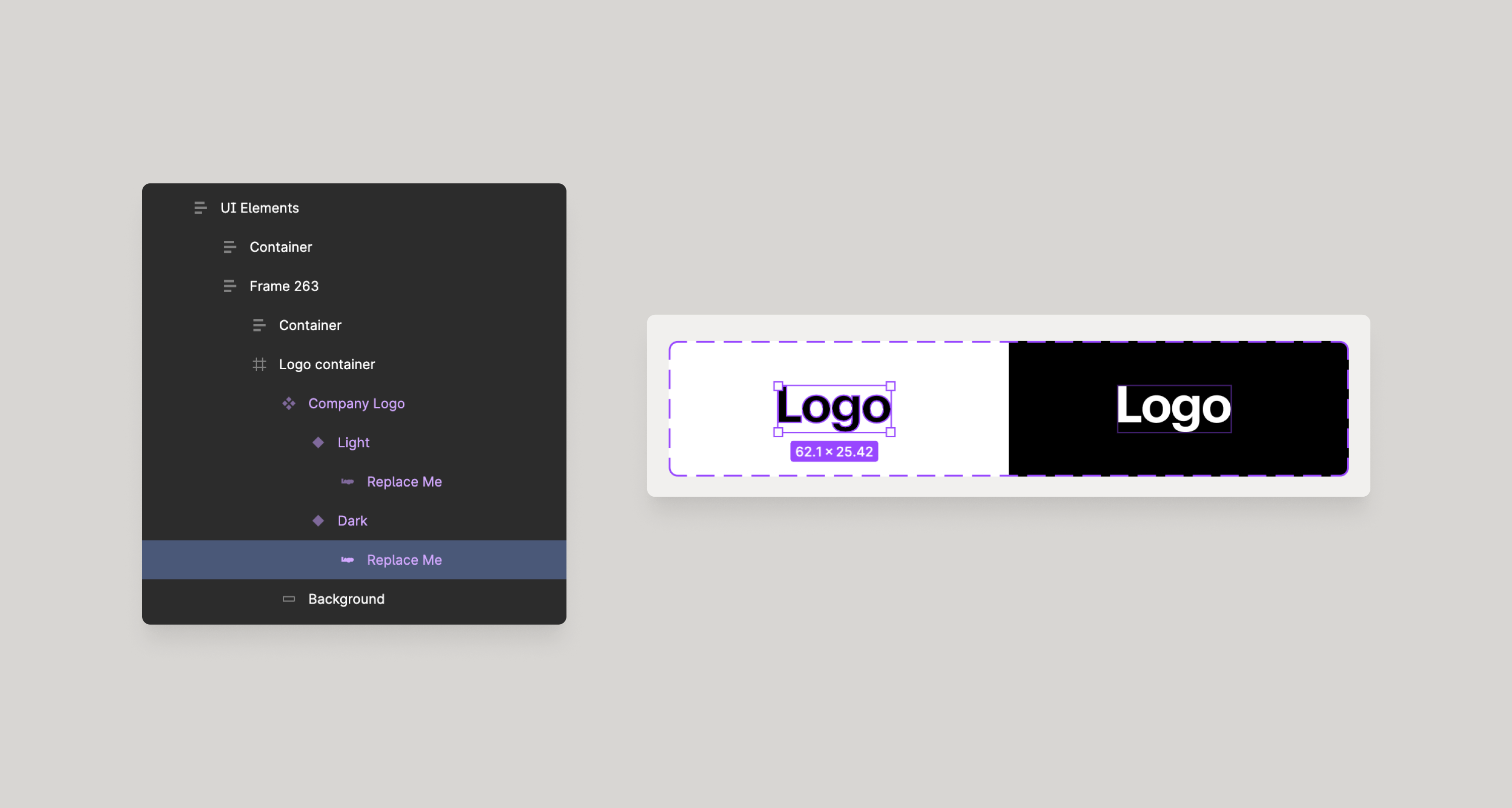
Logos
To edit the logo component in Figma you’ll want to double click on the component and replace the layer that says “LOGO” or it will say “Replace me”. For optimal quality ensure you logo is an SVG.
If your logo is bigger than the component, simply resize it down. You can scale up the instance of the logo once its placed.
Buttons
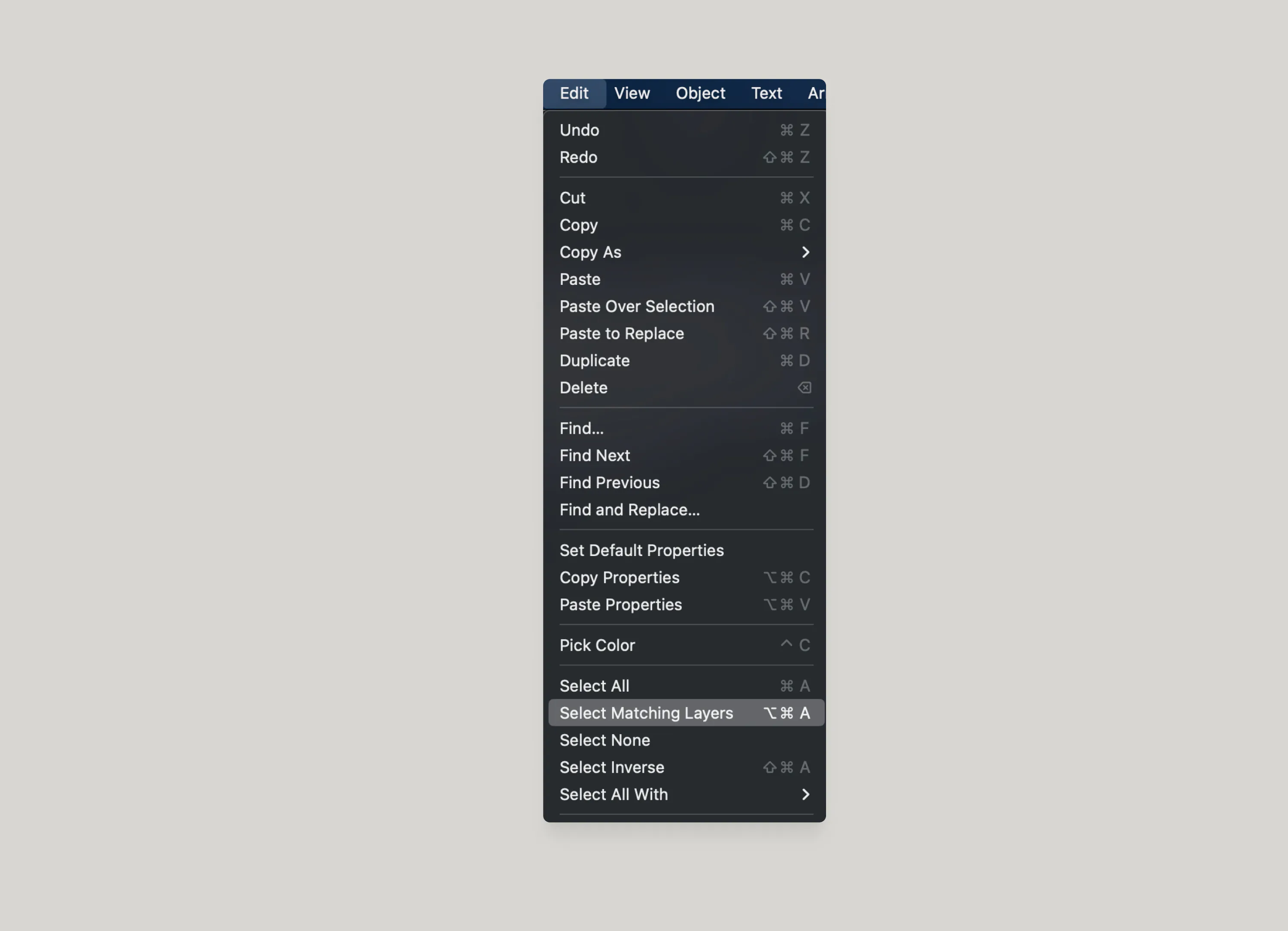
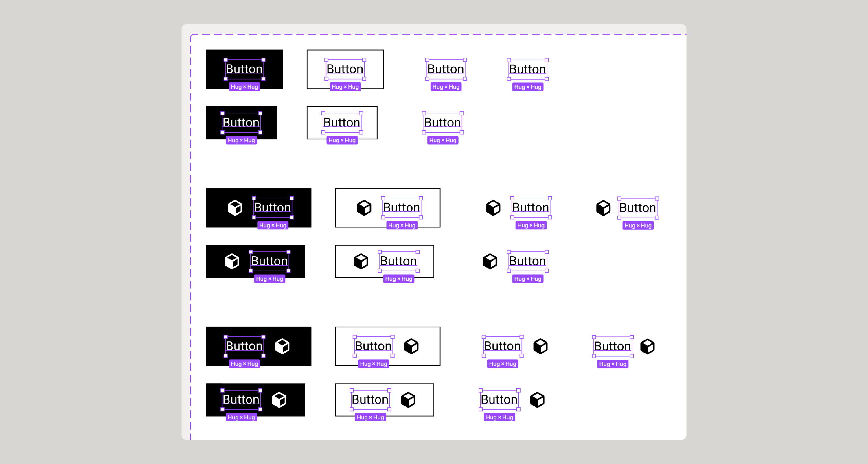
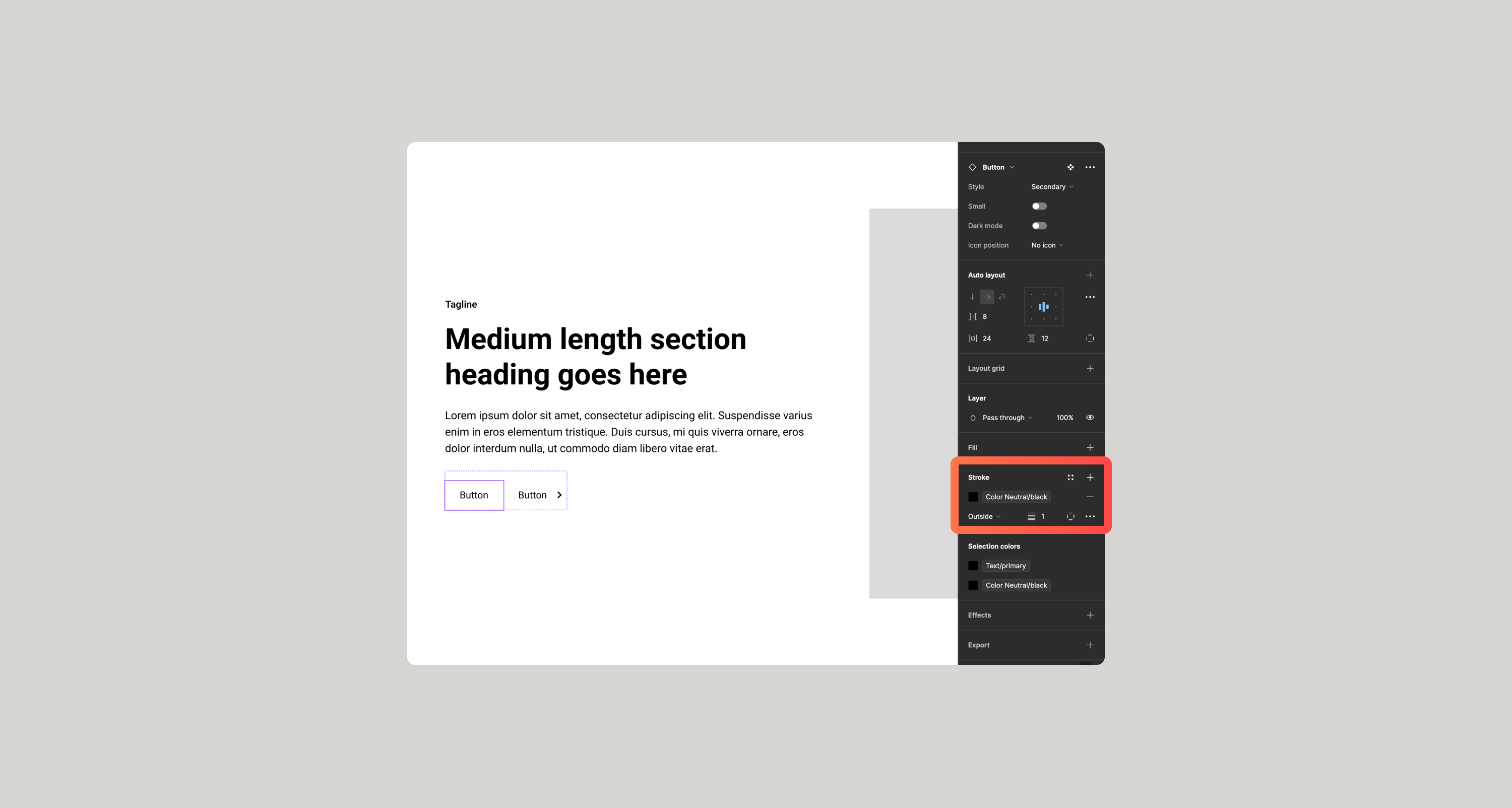
When editing buttons, you can use a couple of shortcuts to make this process quicker. If you select the text within a Button and go to Edit > Select Matching Layers or ⌘⌥A and it will select all of the button labels. Then you can modify whether this label is semi bold, or bold, etc.
You can do the same thing for the actual buttons.
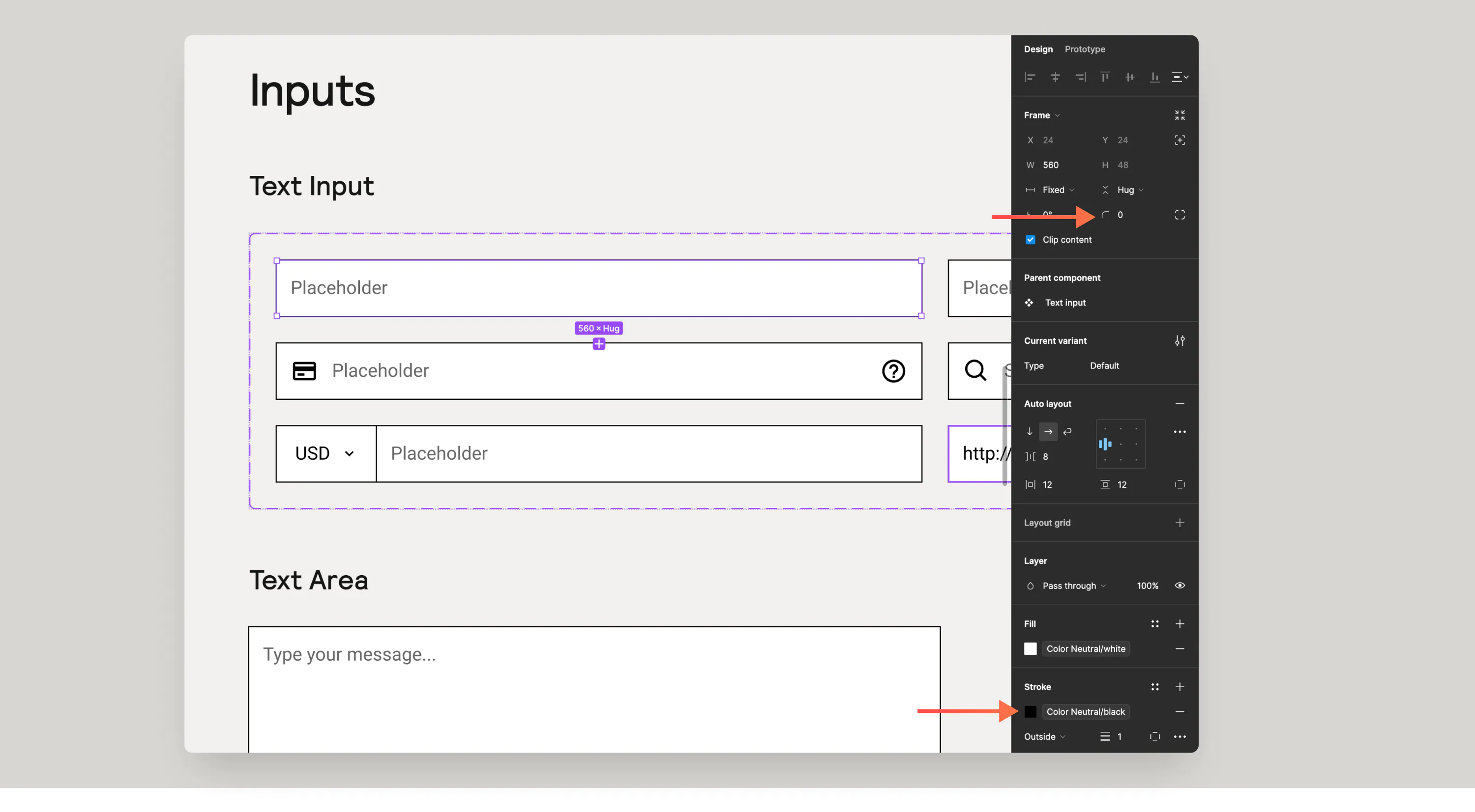
Form Fields
The same shortcut as above applies to input fields. When selected you can adjust border radius, border color and fill color.
Adding your own custom color variables
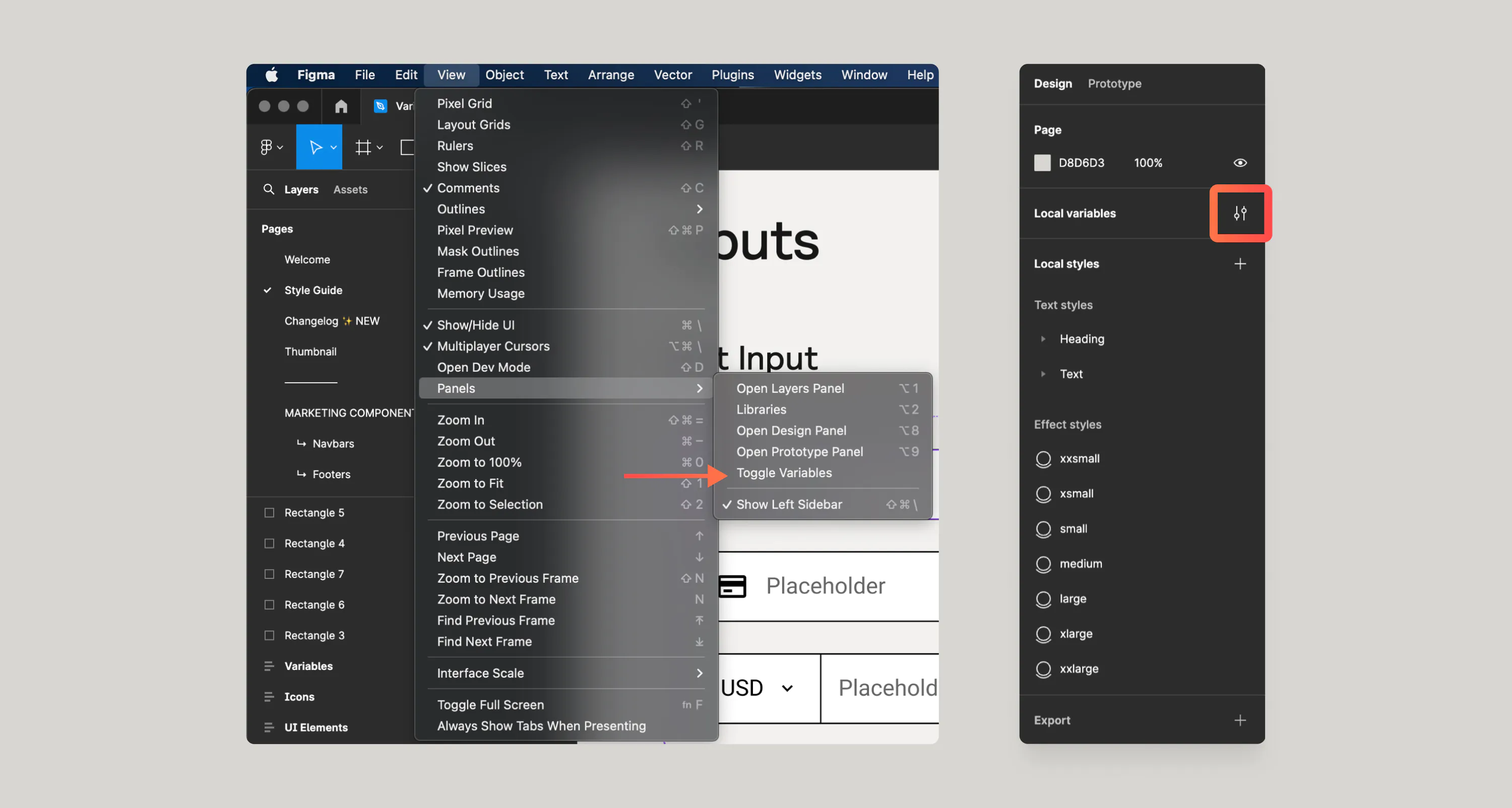
To add your own variables, you’ll want to navigate to the Variables Panel. You can do this by navigation to View > Panels > Toggle Variables or by deselecting all (ESC) and clicking on the Variables panel icon top right.
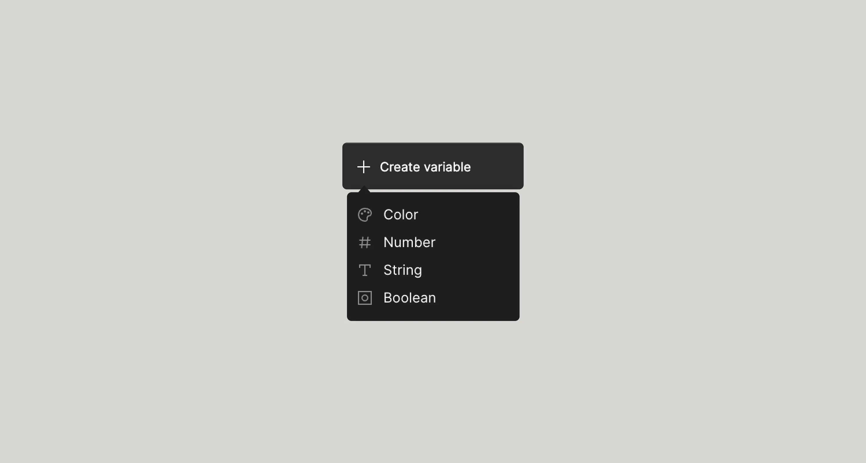
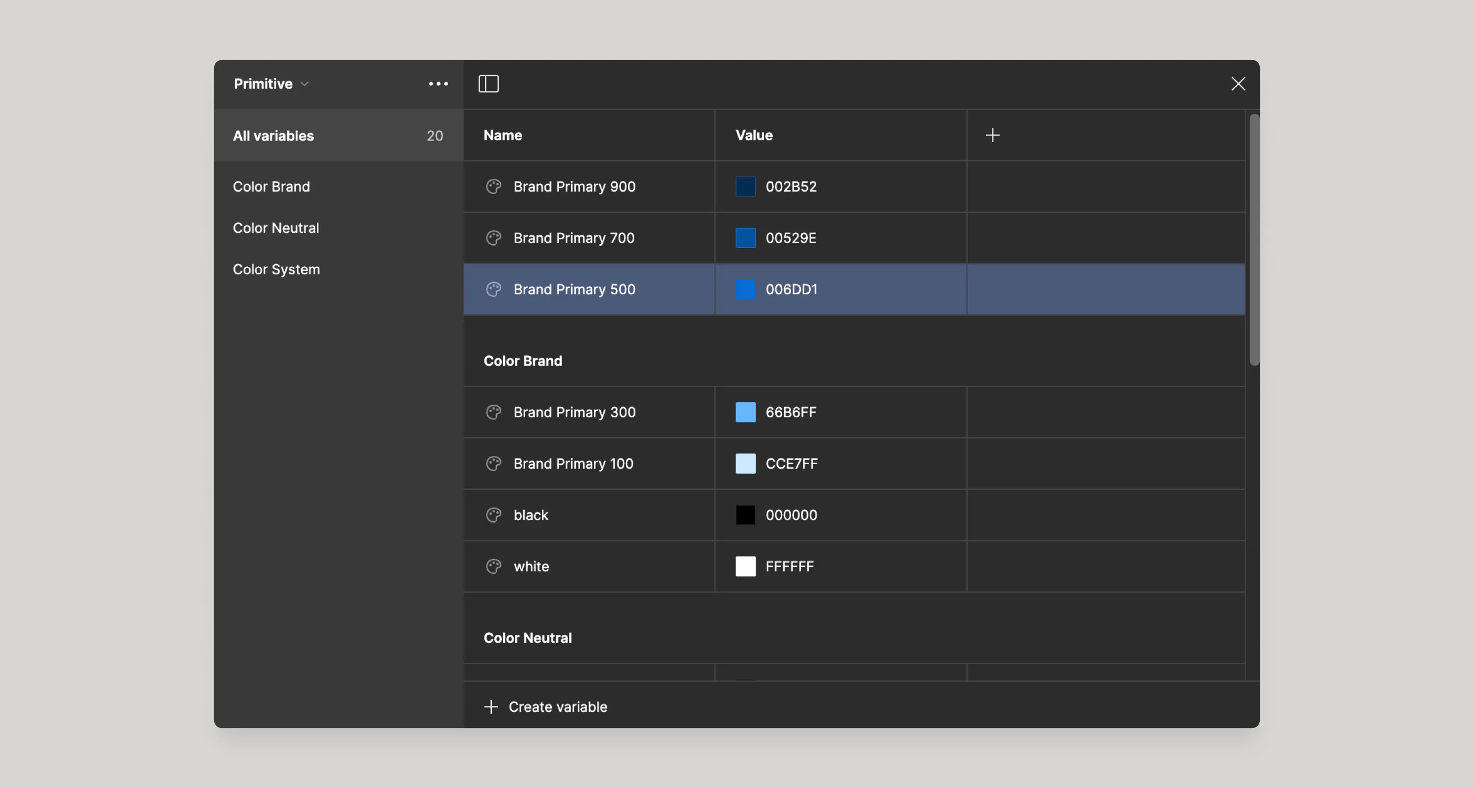
Once you have the panel open, you can add new variables with the Create Variable button at the bottom of the panel. As of right now, our style guides only supports color and size variables. In most cases you will want to add these custom variables inside of the Primitive collection. Primitive variables are the actual color values within a system. The Semantic variables are the variables that are typically assigned directly to specific component elements.
Variable Groups
To add your custom variables to a group you’ll simply just type group name/variable name (e.g. Brand/Primary 900) or if you want them in the same groups that already exist, you can simply drag your new color variable into that group.
Customizing existing color variables
Now that you have your custom variables created, you can link them to the existing variables. Variables in the Style Guide were created in collaboration with Finsweet. Learn more about the Variables strategy for Client-First.
Give feedback
Was this resource helpful?


For account-related issues, please contact support@relume.io.
