


Smarter Wireframes & Copywriting, Plus New Pricing Components
September 10, 2025
It’s a new month which means we’ve made updates to improve Relume. Happy September Release Day!
Here's what's new:
Wireframing 2.0
{{TeamNickMax}}

Wireframing 2.0 is our improved AI wireframe generation system, designed to unlock more creativity, consistency, and brand alignment.
When we first launched Wireframing 1.0 two years ago, it was powered by GPT-3.5. At the time, AI for design was still new, and our priority was to keep outputs consistent and avoid mismatches. To achieve this, Wireframing 1.0 only drew from about 25% of our component library—mostly the safer, more common layouts.
This decision helped us get wireframe generation into the hands of creators early, but it came with a tradeoff: less variety and less creativity. For many Lumers, this made Relume feel “templaty,” with layouts that repeated too often. Behind the scenes, we knew we had a deep and expressive component library—but the AI simply wasn’t surfacing enough of it.
That’s why we built Wireframing 2.0. It’s not just an upgrade—it’s where wireframing with Relume should have started. With smarter models and systems, our AI can now make better design decisions and unlock much more of our component library.
What's new in Wireframing 2.0
Wireframing 2.0 feels more like a professional designer built it—creative, brand-aligned, and with better flow across the entire site.
{{WireframingComparison}}
How it works
What’s next
Wireframing 2.0 is just the start of our renewed focus on Relume AI. Next, we’re making sitemapping smarter—so site structures are clearer from the start, leading to better wireframes, sharper copy, and stronger design foundations. The goal: help you get to solid foundations faster, freeing your energy for the final 20%—the strategy, polish, and details that matter when creating a high-performing website.
We’d love your feedback
Your feedback is key to making Wireframing 2.0 even better. There are two simple ways you can help:
1) Thumbs up / thumbs down: After every generation, you’ll see a thumbs up or thumbs down. Please use it, and if possible, leave a short message about what worked (or didn’t).
2) Candid feedback in-app: In the bottom left corner of the app, you’ll find the feedback option. Use it any time to share your thoughts.
Copywriting 1.5
{{TeamMarcArman}}

When we first launched Copywriting 1.0, it was powered by GPT-3.5 mini with a limited context window of ~10,000 characters. That meant we could only pass in copy instructions for a single section at a time. The result? Disconnected tone, repeated phrases, and copy that didn’t flow across the page.
Now, with Copywriting 1.5, we’ve rebuilt the engine using Anthropic’s Claude model. It considers the entire page at once and writes copy that flows across sections with greater relevance, consistency, and variety. You’ll feel the difference immediately—whether you’re generating a single component or an entire page.
What's new in Copywriting 1.5
{{CopywritingComparison}}
What’s next
We’re committed to making copywriting a strength in Relume, not something you work around. Copywriting 1.5 is an important step forward—but not the final one. Over the coming weeks, we’ll be exploring improvements such as:
Givingyou more control over tone of voice- Making it easier to import and adapt client copy
- Enhancing how copy adapts across pages, not just within one
Think of this release as a strong step forward, with more upgrades on the horizon.
We’d love your feedback
Your feedback is critical in helping us improve copywriting. Here are three ways you can make a big impact:
1) Thumbs up / thumbs down: After every generation, click the feedback icon. If possible, leave a short note explaining what worked (or didn’t).
2) Candid feedback in-app: In the bottom-left corner of Relume, you’ll see the feedback option. Use it any time to share your thoughts.
3) Email our team: If you want to be more involved, reach out directly to our Product Designer marc@relume.io
New Pricing Components
We’ve expanded our library with 30 brand-new Pricing Sections, giving you more flexibility than ever when showcasing plans.
Here’s what’s new:
- 4 Plan Sections – Fresh 4-column layouts so you’ll always have enough options to match your design needs.
- 2 & 4 Plan Comparison Sections – New comparison sections designed to fill gaps when suggesting relevant components.
- Tabs – More tab variants with center- and left-aligned text, making it easier to organize pricing details.
- Toggle Option – A popular SaaS-style toggle lets users switch between pricing options seamlessly.
These updates make it easier to present pricing clearly and in the format that best fits your site.
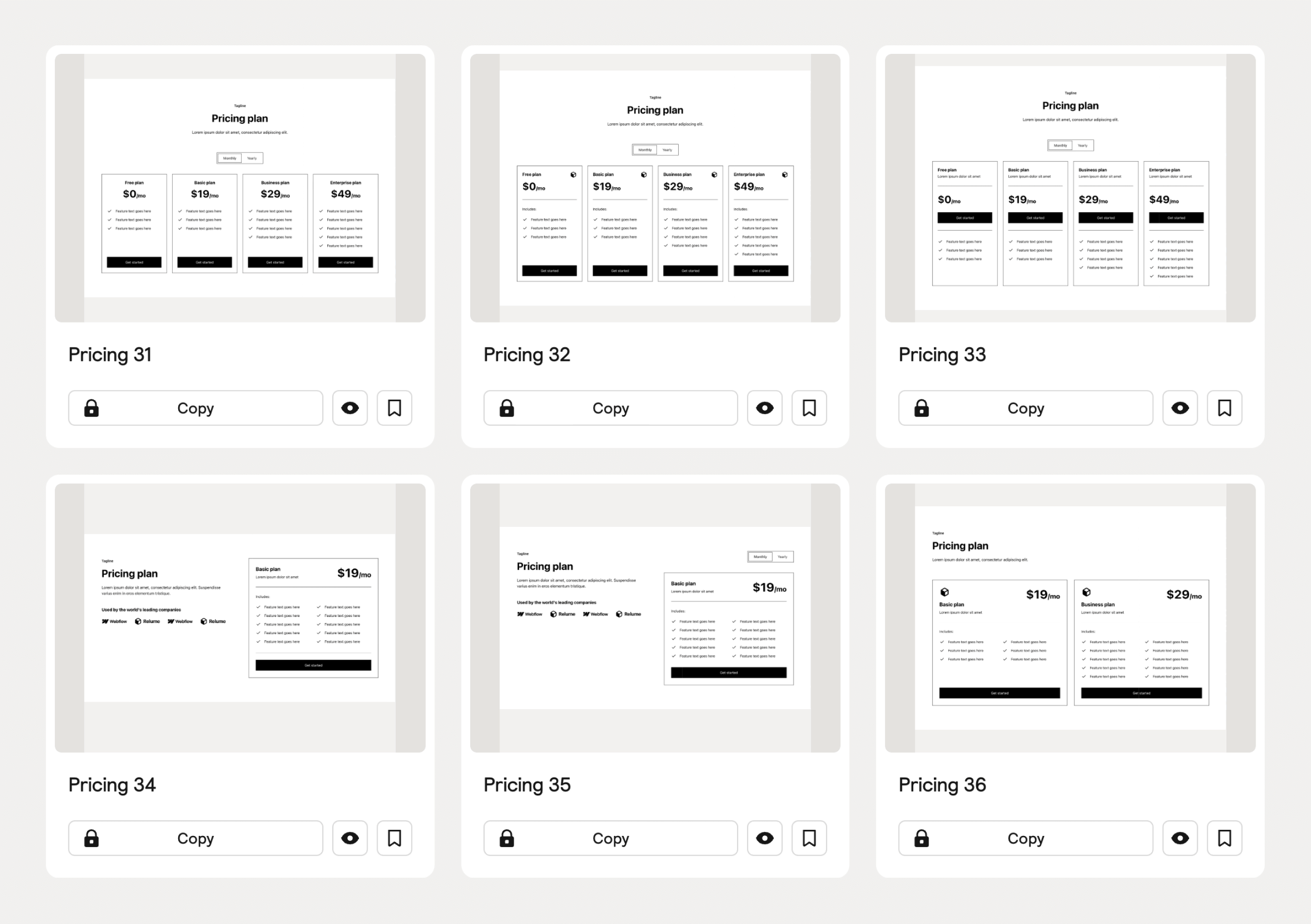
Inspiration
If you're looking for some inspiration on how to use the new Pricing Sections, here are a few designs the team has put together.

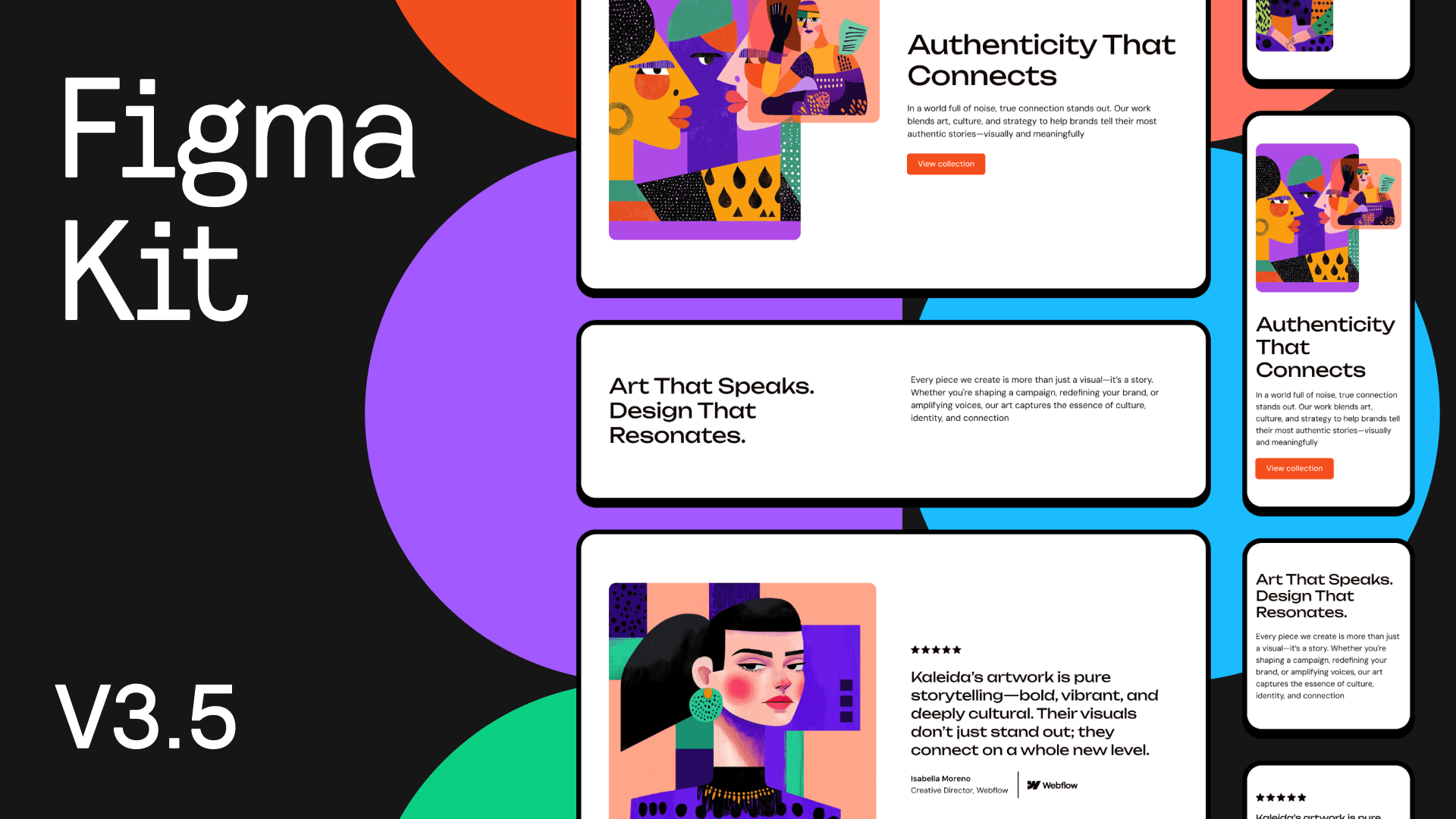
Figma Kit Update v3.5
{{TeamDamianMariaKaleb}}
We have added the 30 new components to our Relume Figma Kit, which is available in both desktop and mobile variants. To receive the latest update, visit the Figma Library in your dashboard.
Community Roadmap Update
We've moved the top-voted item into in-progress which means you can expect to see this drop in upcoming release days.
.png)
The Relume Design League FINAL
.png)
Nearly a million watched and now only 2 contestants remain. Who will take the crown?
After weeks of web design competitions for brands like Notion and Figma, the Relume Design League reaches its finale. This Saturday (Sept. 13th) at 10am EST, watch Raluca vs Jacob Wright compete head-to-head in the E-Sports of Web Design where YOU vote for the winner.
Cast your vote in our Instagram Story poll or comment on Instagram, TikTok or LinkedIn
Think you’ve got what it takes? Sign up for the next season.
More variety and creative layouts appear in generations.
Wireframes feel “on-brand” from the first draft.
Sections communicate the right thing with the right structure.
Smoother narrative and fewer repetitive beats down the page.
A more unified site with less rework later.
Less repetition, smoother flow across sections
Sharper, more natural copy.
Saves editing time, closer to production-ready.
Feels like one voice, not stitched-together fragments.


.avif)


.avif)

.avif)

.webp)

.webp)


