


Image Editing, Component Shuffling, New Components & More
November 6, 2025
It’s a new month which means we’ve made updates to improve Relume. Happy November Release Day!
Here's what's new:
Image Editing
{{TeamAndyTrungWeidong}}
Images just got a major upgrade in Site Builder. You can now adjust aspect ratios, image positions, width, shape and more — directly inside your components. No jumping between tools or losing your flow. It’s a smoother, faster way to fine-tune your designs before importing them into Webflow and Figma.
At Relume, we’re not about endless control, we’re about the right control. Too many options slow you down and make web design and development harder to scale. That’s why Relume gives you just what you need, when you need it. Our “design within rails” approach helps you move faster, stay consistent, and focus on what truly matters: creating high-quality websites that scale beautifully.
How it works
Select any image directly inside a component to reveal a dedicated image panel. From there, you’ll find all the essential controls. For image-heavy sections, jump to section-level controls to make sweeping updates in one go.
We'd love your feedback
Your feedback plays a key role in shaping the Relume editing experience. To share your thoughts, open the Feedback option in the bottom-left corner of the app anytime to share your thoughts.
Improved Component Shuffling
{{TeamMarcShaun}}
Finding the right layout shouldn’t slow you down. Component Shuffling lets you quickly try new layouts right on the canvas within seconds. We’ve also made foundational updates so however you change components, your text, icons, and assets stay mapped, helping you keep momentum as you iterate.
How it works
In the editor, you can now select a component and hit Shuffle to cycle through suggested variations right on the canvas. If you want a different structure or specific layout, just search and Replace with a new component.
Give Component shuffle a spin today and tell us what you think. Your feedback helps shape what we build next.
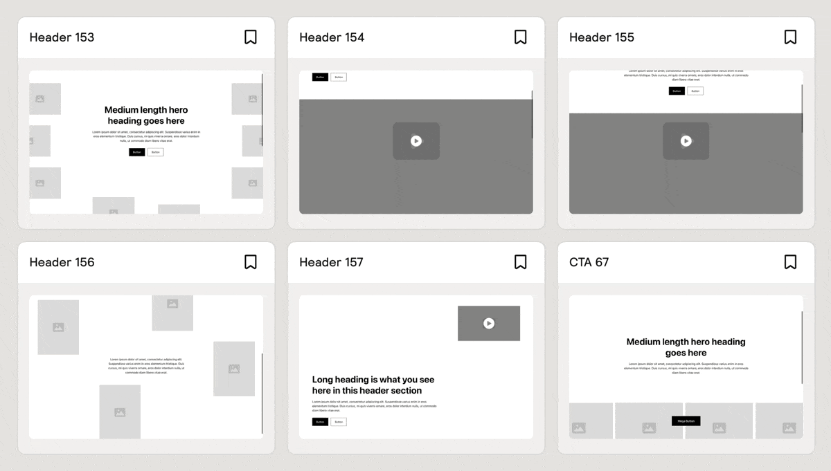
Uncommon Components
{{TeamKalebMaria}}
It’s been a while since we’ve dropped new Uncommon Components, but they’re back and better than ever. This month, we’re releasing 5 new Hero Header Sections and 1 new CTA Section built for Webflow and Figma. Each one brings a fresh mix of bold layouts, thoughtful motion, and standout design to help your next project start strong.
For those new to Relume, Uncommon Components feature more sophisticated layouts and interactions designed to take your website to the next level.
Faster Canvas Performance
{{TeamAndyTrungWeidong}}

We’ve made some under-the-hood improvements to the Relume canvas so it feels smoother and more responsive, especially when working on large projects.
By optimizing how the editor handles rendering, layout, and image loading, we’ve cut down unnecessary re-renders and reduced GPU and memory usage. The result: panning, scrolling, and zooming now run up to 4× faster, with noticeably smoother movement and less lag across complex pages.
These updates make editing larger sites feel lighter, faster, and more stable than ever before.
Figma Kit Update v3.7
{{TeamKalebMaria}}
We have added the 5 new components to our Relume Figma Kit, which is available in both desktop and mobile variants. To receive the latest update, visit the Figma Library in your dashboard.

More variety and creative layouts appear in generations.
Wireframes feel “on-brand” from the first draft.
Sections communicate the right thing with the right structure.
Smoother narrative and fewer repetitive beats down the page.
A more unified site with less rework later.
Less repetition, smoother flow across sections
Sharper, more natural copy.
Saves editing time, closer to production-ready.
Feels like one voice, not stitched-together fragments.


.avif)


.avif)

.avif)

.webp)

.webp)


